Updated September 12, 2018
Animated Image Overlay in React Native
Originally publish on medium.com.
When you like a picture on Instagram a heart quickly scales and fades in over the image you liked — how would we go about accomplishing the same in React Native? In this quick tutorial we’ll cover exactly that.
Getting Started
This tutorial builds on top of a previous tutorial in which we implement a double tap component.
To get started, create a new project with Create React Native App.
Terminal
create-react-native-app AnimatedImageOverlay
cd AnimatedImageOverlay
Next, download the following zip file, unzip it, and place it in your new React Native project. Make sure to name the directory src.
Then update App.js to be
App.js
import App from './src';

export default App;
Overlaying Images
We’ll start off by adding the necessary styles to successfully overlay an image on another.
First we’ll create a new method to render the overlayed image.
App.js
export default class App extends React.Component {
  // ...

  renderOverlay = () => {
    return (
      <View style={styles.overlay}>
        <Image
          source={require('./images/heart.png')}
          style={styles.overlayHeart}
        />
      </View>
    );
  };

  // ...
}
We’ll then render the overlay. The DoubleTap component only accepts one child so we need to wrap our Imagecomponent in a View. Fortunantely, this helps with layout as well.
App.js
export default class App extends React.Component {
// ...
render() {
return (
<View style={styles.container}>
<DoubleTap onDoubleTap={this.toggleLike}>
<View>
<Image
source={{
uri: `https://images.pexels.com/photos/671557/pexels-photo-671557.jpeg?auto=compress&cs=tinysrgb&dpr=2&w=${w.width}`,
}}
style={{ width: w.width, height: w.width }}
resizeMode="cover"
/>
{this.renderOverlay()}
</View>
</DoubleTap>
{/* ... */}
</View>
);
}
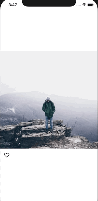
}That leaves us with the following:

To fix this we’ll setup some absolute positioning for the containing view to take up the full area and center its contents. We’ll also set the tintColor of the image to white.
App.js
const styles = StyleSheet.create({
  // ...
  overlay: {
    position: 'absolute',
    alignItems: 'center',
    justifyContent: 'center',
    left: 0,
    right: 0,
    top: 0,
    bottom: 0,
  },
  overlayHeart: {
    tintColor: '#fff',
  },
});

Animating the Image
First thing we need to do to animate the image: import Animated from React Native.
We’ll then set up a new animated value on the component. This will drive both the opacity change and scaling thanks to our ability to interpolate animated values in React Native.
App.js
export default class App extends React.Component {
  // ...

  animatedValue = new Animated.Value(0);

  // ...
}
Next we’ll modify the animatedValue when we've liked the picture. To do this we'll modify the toggleLike method. If the image is liked we'll start an animated sequence that brings this.animatedValue to a value of 1 and immediately brings it back to 0. I'm going to use Animated.spring because I like the way it looks here.
App.js
export default class App extends React.Component {
  // ...

  toggleLike = () => {
    this.setState((state) => {
      const newLiked = !state.liked;

      if (newLiked) {
        Animated.sequence(
          \[
            (Animated.spring(this.animatedValue, {
              toValue: 1,
              useNativeDriver: true,
            }),
            Animated.spring(this.animatedValue, {
              toValue: 0,
              userNativeDriver: true,
            }),
            \)
          ]
        ).start();
      }

      return { liked: newLiked };
    });
  };

  // ...
}
Last thing we’ll do is modify the renderOverlay method to use our animated value to modify the styles. First, replace the Image component with an Animated.Image so that we can use animated values and the component knows what to do with them.
We’ll then set up an array of of our new image styles. First will be our existing styles.overlayHeart, next will be an object with our dynamic styles.
Opacity is a value from 0 to 1 so we can just pass that directly to opacity. We'll then use the scale property to start the image slightly smaller and scale larger. We can specify the exact values by using this.animatedValue.interpolate. Here's the code.
App.js
export default class App extends React.Component {
  // ...

  renderOverlay = () => {
    const imageStyles = [
      styles.overlayHeart,
      {
        opacity: this.animatedValue,
        transform: [
          {
            scale: this.animatedValue.interpolate({
              inputRange: [0, 1],
              outputRange: [0.7, 1.5],
            }),
          },
        ],
      },
    ];

    return (
      <View style={styles.overlay}>
        <Animated.Image
          source={require('./images/heart.png')}
          style={imageStyles}
        />
      </View>
    );
  };

  // ...
}
That leaves us with the following.

The final code can be found on Github
