Updated June 22, 2022
Build Themed Components in React Native
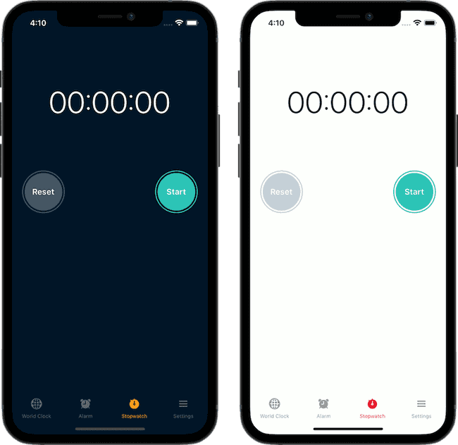
Building a multi-theme app doesn't have to be complicated, so long as you take advantage of custom components. In this tutorial we'll cover how to create your own versions of core React Native components that are automatically themed to use the right colors based on the user's preferred color scheme.
Take a look at the code for the StopWatch screen below. There's nothing unique to supporting multiple themes in it, but it fully supports multiple themes thanks to the custom components we'll create.
// screens/StopWatch.tsx

import { StyleSheet } from "react-native"

import { Text, View, StatusBar, SafeAreaView } from "components/themed"
import { CircleButton } from "components/buttons"
import { useStopWatch } from "hooks/useStopWatch"
import { LapList } from "components/lists"

const StopWatch = () => {
  const {
    time,
    isRunning,
    start,
    stop,
    reset,
    lap,
    laps,
    currentLapTime,
    hasStarted,
    slowestLapTime,
    fastestLapTime,
  } = useStopWatch()

  return (
    <SafeAreaView style={{ flex: 1 }}>
      <StatusBar />
      <View style={styles.container}>
        <Text style={styles.timeText}>{time}</Text>

        <View style={styles.row}>
          <CircleButton
            onPress={() => {
              isRunning ? lap() : reset()
            }}
          >
            {isRunning ? "Lap" : "Reset"}
          </CircleButton>
          <CircleButton
            onPress={() => {
              isRunning ? stop() : start()
            }}
            color={isRunning ? "red" : "green"}
          >
            {isRunning ? "Stop" : "Start"}
          </CircleButton>
        </View>

        <LapList
          hasStarted={hasStarted}
          currentLapTime={currentLapTime}
          laps={laps}
          fastestLapTime={fastestLapTime}
          slowestLapTime={slowestLapTime}
        />
      </View>
    </SafeAreaView>
  )
}

const styles = StyleSheet.create({
  container: { flex: 1, alignItems: "center" },
  timeText: {
    fontSize: 60,
    fontWeight: "300",
    marginTop: 100,
    fontVariant: ["tabular-nums"], // fixed width character
  },
  row: {
    flexDirection: "row",
    width: "100%",
    justifyContent: "space-between",
    paddingHorizontal: 20,
    marginTop: 100,
  },
})

export default StopWatch
The useThemeColors Hook
At the core of our themed components is the useThemeColors hook. This hook does the heavy lifting for our theme based logic.
We built a version of this hook in a recent tutorial. I would recommend you read it to get a better understanding of how to implement it and the "why" behind it.
From this hook we return an object with two pieces of data in it:
- The colors for the currently active theme. This is standardized between "light" and "dark". It could also expand to other themes as well.
isDarkwill be used to determine the color of things like theStatusBar. We can't change the actual text color but we can determine if the text should be light or dark.
// hooks/useThemeColors.tsx

import Colors from "constants/Colors"
import { useColorScheme } from "hooks/useColorScheme"

export function useThemeColors() {
  const theme = useColorScheme()

  return {
    isDark: theme === "dark",
    colors: Colors[theme],
  }
}
The View Components
The goal of our custom View component is to serve as a building block that functions just like a normal View. All we do is set the background color and then forward any user defined props onto the underlying View.
This allows us to use the custom View just like a normal View, including overriding our default background color. The same goes for the SafeAreaView.
// components/themed/View.tsx

import { View as DefaultView, ViewProps } from "react-native"
import { SafeAreaView as DefaultSafeAreaView } from "react-native-safe-area-context"

import { useThemeColors } from "hooks/useThemeColors"

export function View(props: ViewProps) {
  const { style, ...otherProps } = props
  const { colors } = useThemeColors()

  return (
    <DefaultView
      style={[{ backgroundColor: colors.background }, style]}
      {...otherProps}
    />
  )
}

export const SafeAreaView = (props: ViewProps) => {
  const { style, ...otherProps } = props
  const { colors } = useThemeColors()

  return (
    <DefaultSafeAreaView
      style={[{ backgroundColor: colors.background }, style]}
      {...otherProps}
    />
  )
}
Learn how to set up path alias' like you see used throughout this post
The Text Component
Just like the View component all the Text component does is set the text color based on the theme. Other options could be to set a default font family, add different text types ("title", "subtitle", etc). Even if you're not supporting multiple themes creating your own Text component is a great practice so you don't need to update styles all over your app when a font family changes.
// components/themed/Text.tsx

import { Text as DefaultText, TextProps } from "react-native"

import { useThemeColors } from "hooks/useThemeColors"

export const Text = (props: TextProps) => {
  const { style, ...otherProps } = props
  const { colors } = useThemeColors()

  return <DefaultText style={[{ color: colors.text }, style]} {...otherProps} />
}
The StatusBar Component
This one is unique because we can only customize parts of it. Therefore we use the isDark data to determine whether we should use the light text or dark text. We can also set the background color of the StatusBar on Android.
The benefit of using this approach is that if we choose to add more themes (as the example repo this tutorial is based on has) we can define if a theme is light or dark in one place.
// components/themed/StatusBar.tsx

import { StatusBar as DefaultStatusBar, StatusBarProps } from "react-native"

import { useThemeColors } from "hooks/useThemeColors"

export const StatusBar = (props: StatusBarProps) => {
  const { isDark, colors } = useThemeColors()

  const barStyle = isDark ? "light-content" : "dark-content"

  return (
    <DefaultStatusBar
      barStyle={barStyle}
      backgroundColor={colors.background}
      {...props}
    />
  )
}
CHALLENGE
There are more default UI elements you can theme. With what's been discussed here, how would you do it?
- The different buttons. Notice they have a prop of
colorbut that color stated may not be the same for each theme. - The tab bar from React Navigation. The background color and the icons are customized based on the theme.
The answers exist in the repo but I'd encourage you to think about how you'd do it before digging into the repo to find how I did it.
