Updated July 6, 2022
Flexbox Exercise: Building a Card Game Board
In a recent open source React Native app I had to build a grid of cards to fill the screen. After having a handful of conversations regarding Flexbox recently I thought this would be a nice quick exercise to get some practice.
The app is based on the following reference. All we'll be doing today is the grid layout. The rest (animations, custom hooks, etc.) will be covered later.

You can quickly do the exercise via Expo Snack.
The requirements are:
- Equally fill the remainder of the screen with cards (after other UI elements like stats or buttons)
- Resize for changing screen sizes (such as on web)
- Automatically adjust layout based on number of cards in a row
Flexbox is the perfect tool for this in React Native. Though it can take some time to get used to, this is a good exercise to start getting more comfortable with it.
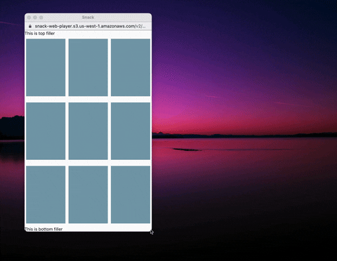
Our end goal, for this exercise, is the following:

Let's start with the following code.
import * as React from "react"
import { Text, View, StyleSheet } from "react-native"
import Constants from "expo-constants"

const Card = () => <View style={styles.card} />

export default function App() {
  return (
    <View style={styles.container}>
      <Text>This is top filler</Text>
      <View style={styles.row}>
        <Card />
        <Card />
        <Card />
      </View>
      <View style={styles.row}>
        <Card />
        <Card />
        <Card />
      </View>
      <View style={styles.row}>
        <Card />
        <Card />
        <Card />
      </View>
      <Text>This is bottom filler</Text>
    </View>
  )
}

const styles = StyleSheet.create({
  container: {
    paddingTop: Constants.statusBarHeight,
  },
  row: {},
  card: {
    backgroundColor: "#7ca1b4",
  },
})
We want each of our rows to equally fill the vertical space and each of our cards to fill that row vertically and to evenly split the space horizontally.
First we want our container to fill up the entire screen. We can do this by setting flex: 1 on our container styles. This is best visualized by temporarily setting a background color.

// ...

const styles = StyleSheet.create({
  container: {
    paddingTop: Constants.statusBarHeight,
    flex: 1,
    backgroundColor: "green",
  },
  row: {},
  card: {
    backgroundColor: "#7ca1b4",
  },
})
Now, we need to tell the row to evenly split the remainder of the screen (via flex: 1).

// ...

const styles = StyleSheet.create({
  container: {
    paddingTop: Constants.statusBarHeight,
    flex: 1,
    backgroundColor: "green",
  },
  row: {
    flex: 1,
    backgroundColor: "blue",
    marginVertical: 5,
  },
  card: {
    backgroundColor: "#7ca1b4",
  },
})
Because each row has a flex: 1 on it the rendering engine knows that each row should take up 1/3 of the available space. If one row had flex: 2 on it, then a flex: 1 would take up 1/5 and a flex: 2 would take up 2/5 of the area.
Next we want our cards to fill the remaining space, sharing it equally. Again we'll leverage flex: 1.

// ...

const styles = StyleSheet.create({
  container: {
    paddingTop: Constants.statusBarHeight,
    flex: 1,
    backgroundColor: "green",
  },
  row: {
    flex: 1,
    backgroundColor: "blue",
    marginVertical: 5,
  },
  card: {
    backgroundColor: "#7ca1b4",
    flex: 1,
    margin: 5,
  },
})
Now, with this, the cards aren't rendered correctly. We want them rendered horizontally, but still split the space equally. We can accomplish this with flexDirection: 'row' on our row style. By default Flexbox in React Native sets the flex direction to column. We'll also remove our placeholder background colors.
// ...

const styles = StyleSheet.create({
  container: {
    paddingTop: Constants.statusBarHeight,
    flex: 1,
  },
  row: {
    flex: 1,
    marginVertical: 5,
    flexDirection: "row",
  },
  card: {
    backgroundColor: "#7ca1b4",
    flex: 1,
    margin: 5,
  },
})
Since we're using flexbox to manage our layout we can be confident that it will fill the screen correctly no matter what size the screen is and that it will also automatically resize if the screen size changes.
This was a super brief exercise into practicing layout with Flexbox. If you'd like to learn more I wrote a more in depth article on Flexbox over on LogRocket.
