Updated March 27, 2019
Normalizing Text and Spacing Between Screen Sizes
Example.js
const styles = StyleSheet.create({
  text: {
    color: '#d4895e',
    fontWeight: 'bold',
    fontSize: 40,
    marginHorizontal: 20,
  },
});
That's pretty standard to have in your styles, right? I'd say so. It's what most of my code looks like!
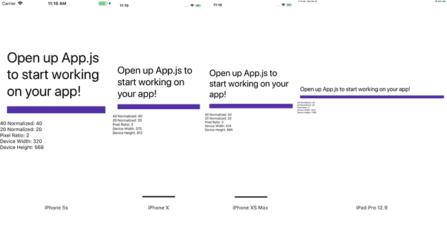
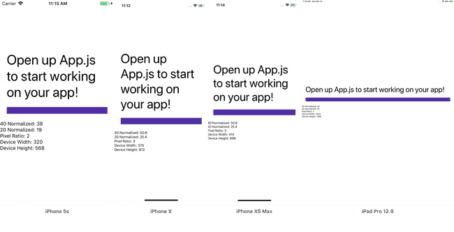
But how does that look on different devices?
My phone is an iPhone X - it's also the device I use as a simulator when developing my apps. It's a phone with a big beautiful screen and I base everything on it.
But what happens if I spin up that same app on an iPhone 5? Or an iPhone 4? What about an older android device? Or lower budget one?
There's a lot of options out there and we need to factor for those in our designs. A 40 pixel font size is going to look drastically different on an iPhone XS Max vs. an iPhone 4.
Fortunately, accounting for this doesn't have to be hard.
There are two factors we'll want to take into consideration when "normalizing" font sizes, padding, margin, etc. between different devices.
- Pixel Density/Ratio
- Screen Dimensions
PixelRatio in React Native
PixelRatio has a variety of functions. In this context we're interested in PixelRatio.get(), which returns the pixel density of the device.
This aligns with the @1x, @2x, and @3x you see on iOS or mdpi, hdpi, xhdpi, etc. you see on Android.
We'll use this as a first pass to determine at what ratio we want to modify the sizes.
Check out the other functions available to you from PixelRatio as well and let me know if you want to cover them in more detail.
Dimensions in React Native
Dimensions is pretty straightforward. We're going to use it to get the width and height of the device window.
Why? Well this will give us a good reference on how much to scale the number we're working with. If it's a narrow device (small width) we may want to scale the font size down so each line doesn't only have one word.
React Native Elements: A Fantastic Resource
Before we dive into code I wanted to give credit where credit is due: React Native Elements. This UI toolkit is not only great to use but it's also a fantastic reference on good patterns in React Native.
I've used their normalizeText file as a reference for numerous projects, including today's lesson. I would highly encourage you to check it out.
The Normalize Function
I'll typically put a normalize function in some sort of utility file, like src/utilities/normalize.js and import wherever I need it in my app.
In this file I'll typically grab the PixelRatio once and the device dimensions each time the function is called.
src/utilities/normalize.js
import { PixelRatio, Dimensions } from 'react-native';

const ratio = PixelRatio.get();

const normalize = (size) => {
  const { width, height } = Dimensions.get('window');

  return size;
};

export default normalize;
Why grab the width/height each time the function is called? Because it can change depending on device orientation. I've also found that the overhead of doing this is minimal/non-existent.
Categorizing By PixelRatio
Next, we'll go ahead and break the code into three general categories based on the device pixel ratio.
src/utilities/normalize.js
import { PixelRatio, Dimensions } from 'react-native';

const ratio = PixelRatio.get();

const normalize = (size) => {
  const { width, height } = Dimensions.get('window');

  if (ratio >= 2 && ratio < 3) {
    // scale
  } else if (ratio >= 3 && ratio < 3.5) {
    // scale
  } else if (ratio >= 3.5) {
    // scale
  }

  return size;
};

export default normalize;
With this we're using a pixel ratio of 1 as our baseline and we'll then scale fonts based on that, breaking it into common categories. Typically a ration is going to be 1, 2, or 3 but they can fall in between them as well (looking at you Android) so we'll work with ranges.
Categorizing By Dimensions
This is the first spot your discretion is going to come into play - where are the "breakpoints" within your app that you should start modify font sizes? I'm going to follow what React Native Elements uses because it's always worked for me in the past.
They're the same break points for each pixel density.
src/utilities/normalize.js
import { PixelRatio, Dimensions } from 'react-native';

const ratio = PixelRatio.get();

const normalize = (size) => {
  const { width, height } = Dimensions.get('window');

  if (ratio >= 2 && ratio < 3) {
    if (width < 360) {
      // scale
    } else if (height < 667) {
      // scale
    } else if (height >= 667 && height <= 735) {
      // scale
    }

    // scale
  } else if (ratio >= 3 && ratio < 3.5) {
    if (width < 360) {
      // scale
    } else if (height < 667) {
      // scale
    } else if (height >= 667 && height <= 735) {
      // scale
    }

    // scale
  } else if (ratio >= 3.5) {
    if (width < 360) {
      // scale
    } else if (height < 667) {
      // scale
    } else if (height >= 667 && height <= 735) {
      // scale
    }

    // scale
  }

  return size;
};

export default normalize;
We've got three categories:
- Device width is less than 360 (narrow phone)
- Device height less than 667
- Device height between 667 and 735
- The rest.
The Scaling Factor
This is really where your discretion is going to come into play. You'll have to tinker with the scaling ratio to get it to look just right. Typically the scaling ratio is going to be +/- 0.2 (unless you're targeting tablets as well).
I'll show you the final value in the "Final Code" section, again based on React Native Element's values. Use it as a reference point and modify based on your needs, just like you would device breakpoints.
Simplifying your Code
If you want to do your normalizing in bulk you can just create StyleSheet.create with the following code. It will look for a series of target keys and normalize those automatically otherwise it will just forward them along without any changes.
src/utilities/normalize.js
// ...

export const create = (
  styles,
  targetProperties = [
    'fontSize',
    'margin',
    'marginHorizontal',
    'marginVertical',
    'padding',
    'paddingVertical',
    'paddingHorizontal',
    'height',
  ]
) => {
  const normalizedStyles = {};
  Object.keys(styles).forEach((key) => {
    normalizedStyles[key] = {};
    Object.keys(styles[key]).forEach((property) => {
      if (targetProperties.includes(property)) {
        normalizedStyles[key][property] = normalize(styles[key][property]);
      } else {
        normalizedStyles[key][property] = styles[key][property];
      }
    });
  });

  return StyleSheet.create(normalizedStyles);
};
src/Example.js
import { create } from '../utilities/normalize.js';

const styles = create({
  text: {
    color: '#d4895e',
    fontWeight: 'bold',
    fontSize: 40,
    marginHorizontal: 20,
  },
});
Final Code
src/utilities/normalize.js
import { PixelRatio, Dimensions } from 'react-native';

const ratio = PixelRatio.get();

const normalize = (size) => {
  const { width, height } = Dimensions.get('window');

  if (ratio >= 2 && ratio < 3) {
    if (width < 360) {
      return size * 0.95;
    } else if (height < 667) {
      return size;
    } else if (height >= 667 && height <= 735) {
      return size * 1.15;
    }

    return size * 1.25;
  } else if (ratio >= 3 && ratio < 3.5) {
    if (width < 360) {
      return size;
    } else if (height < 667) {
      return size * 1.15;
    } else if (height >= 667 && height <= 735) {
      return size * 1.2;
    }

    return size * 1.27;
  } else if (ratio >= 3.5) {
    if (width < 360) {
      return size;
    } else if (height < 667) {
      return size * 1.2;
    } else if (height >= 667 && height <= 735) {
      return size * 1.25;
    }

    return size * 1.4;
  }

  return size;
};

export const create = (
  styles,
  targetProperties = [
    'fontSize',
    'margin',
    'marginHorizontal',
    'marginVertical',
    'padding',
    'paddingVertical',
    'paddingHorizontal',
    'height',
  ]
) => {
  const normalizedStyles = {};
  Object.keys(styles).forEach((key) => {
    normalizedStyles[key] = {};
    Object.keys(styles[key]).forEach((property) => {
      if (targetProperties.includes(property)) {
        normalizedStyles[key][property] = normalize(styles[key][property]);
      } else {
        normalizedStyles[key][property] = styles[key][property];
      }
    });
  });

  return StyleSheet.create(normalizedStyles);
};

export default normalize;
