Updated October 29, 2021
React Native Animation Using Reanimated 2
Originally publish on aditya01.hashnode.dev.


Aditya Pahilwani
Love to talk about react native, cross-platform development, and how things work under the hood.
Hello everyone 👋, I guess you want to learn how to create some amazing animations in React-Native with Reanimated 2. Don't worry you're in the right place.
Editor's Note: Thanks to Aditya for sharing this article with React Native School. Check out his website aditya01.hashnode.dev and follow him on Twitter.
What we are creating?
We are going to create a bottom navigation bar animation. This will animate the color and view when you switch tabs.😍😍

The above gif looks amazing, right? we are going to create the same animation.
Prefer Video?
I have given a full talk on this topic in case you wanna check out
Understanding The Basic Animation Needs

So in our UI, we got 2 things Icons and selectedContainer. On every tab-press, we need to animate our position of selectedContainer to the selected-tab along with the selected color.
So, it's clear that we want the positions and coordinates of every icon, so we can translate our selectedContainer to the selected tab, the quick solution which might come to your mind is onLayout but that's a kind of expensive operation. We are going to ditch onLayout and instead use some neat tricks and basic maths to calculate the position of the tabs.
We got a basic idea, now we can start with the code and solve all the problems and challenges which will come along.
What we are going to do
There are a lot of things in this tutorial. We are going to break our tutorial into smaller parts, so you can understand it better.
- Boiler code
- Understanding the logic
- Adding animation config to translate out selected tab
- Solution for hidden tabs
- Decouple behind the scene magic
- Bonus: Handling keyboard popups
- Adding animation to handle keyboard popups
- Celebration
Let's go through each of them one by one. 🚀
Boiler code
Before the Boiler code, let me walk through you the folder structure we are going to follow for this blog. But you can follow any structure as you like.

constant: This will contain some constants which will be used in our components and styles.style: This will contain styling for our component.bottomNavigation: This will contain our main component.index: This will export our component.
This is our constant file.
// constant.js

import { Dimensions } from "react-native"
const { width } = Dimensions.get("window")
export const icons = [
  { name: "send", color: "#28c7fa" },
  { name: "home", color: "#ff304f" },
  { name: "search", color: "#22eaaa" },
  { name: "user", color: "#ffd717" },
]
export const iconContainer = 50
export const tabBlock = width / icons.length
export const activeIndex = 0
export const bottomBarHeight = 70
export const bottomBarWidth = widthiconsis an array that holds our tabs data which are name and color, name indicates the name of Feather icon, and color indicates the color of the icon.iconContainerrepresents the size of the icon container while will reside inside the tabBlock.tabBlockrepresents the size of tabs, in the ideal case you just use -justifyContent:'space-evenly'in a container, but we are going to manually set the size of tabs for our secret trick of calculating tab positions.
Let's move to our style file.
// style.js

import { StyleSheet } from "react-native"
import {
  iconContainer,
  tabBlock,
  bottomBarHeight,
  bottomBarWidth,
} from "./constant.js"

const styles = StyleSheet.create({
  bottomTabContainer: {
    elevation: 4,
    height: bottomBarHeight,
    width: bottomBarWidth,
    backgroundColor: "black",
    flexDirection: "row",
    alignItems: "center",
  },
  tabContainer: {
    height: "100%",
    width: tabBlock,
    justifyContent: "center",
    alignItems: "center",
  },
  iconContainer: {
    height: iconContainer,
    justifyContent: "center",
    alignItems: "center",
    width: iconContainer,
    borderRadius: iconContainer / 2,
  },
  selectedContainer: {
    overflow: "hidden",
    height: iconContainer,
    justifyContent: "center",
    alignItems: "center",
    width: iconContainer,
    borderRadius: iconContainer / 2,
    position: "absolute",
    bottom: bottomBarHeight / 2 - iconContainer / 2,
    left: 0,
  },
})

export default styles
The only piece of weird style is in selectedContainer, now our selectedContainer will be positioned absolute, we need to make sure it is properly centered in context of our bottom-navigation so we add bottom: bottomBarHeight / 2 - iconContainer / 2. This will make sure our selectedContainer will be properly centered.
The main component
This is our main component file, where we will add our beautiful animations later.
// bottomNavigation.js

import React from "react"
import { View, Pressable, Dimensions } from "react-native"
import { Feather } from "@expo/vector-icons"
import styles from "./style"
import Animated, { useSharedValue } from "react-native-reanimated"
import { activeIndex, icons } from "./constant.js"

const BottomNavigationTapPress = props => {
  const selectedIndex = useSharedValue(activeIndex)
  return (
    <Animated.View
      style={[styles.bottomTabContainer, { position: "absolute", bottom: 0 }]}
    >
      {icons.map((item, index) => {
        return (
          <Pressable
            key={item.name}
            onPress={() => {
              selectedIndex.value = index
            }}
          >
            <View style={styles.tabContainer}>
              <Animated.View style={[styles.iconContainer]}>
                <Feather name={item.name} size={24} color={item.color} />
              </Animated.View>
            </View>
          </Pressable>
        )
      })}

      <Animated.View style={[styles.selectedContainer]}></Animated.View>
    </Animated.View>
  )
}

export default BottomNavigationTapPress
The boilerplate code is done.
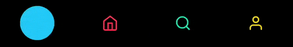
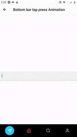
Thanks for sticking with me and following along with the boilder code. Now you will see a similar output as attached below.

It looks very weird, right? the selectedContainer is aligned in the wrong position and it's overlapping on our icon too. So we need to fix our alignment of selectedContainer and want it to translate to the selected tab respectively. Before coming with a solution let's take a step back and understand our UI first.
Understanding the logic
Now let's understand our UI and how we can translate our selectedContainer to specific tab position without onLayout.

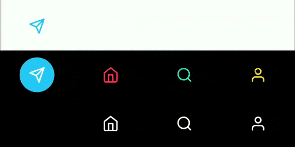
- The blue-colored-tab is our
tabContainer. - The grey-colored-container is our
iconContainerwhich shares the same size ofselectedContainer. (note: This is just for explanation, the background color of iconContainer won't be displayed, it would be transparent.)
To align our selectedContainer and translating to the respective selected tab, we want their positions so we can translate our container, Accordingly.
Now we are going to use a neat trick and do some basic maths. As our every tabContainer and iconContainer are of the same size. That means we can manually calculate the positions based on the index of the tab.
Guess what? All of the constants required to make this calculation is already with us.
selectedIndex.value * tabBlock + tabBlock / 2 - iconContainer / 2Let me explain the piece of magic with this simple calculation.
selectedIndex.valuerepresents the selected-tab index value.tabBlockandiconContainerwere the constant which we declared in our separate constant file giving us the size of the tab and icon-container.selectedIndex.value * tabBlockgives us the starting value of our tabBlock, but we want our container to be centered aligned with the tab.tabBlock / 2gives us the center point of our tabBlock, with this we got our center point of selected tab.- Still, our iconHolder won't be centered aligned because our selectedContainer will paint from the exact center of the tabBlock. As iconContainer and our selectedContainer share the same size, we can use our constant to compute the exact position to start the paint from.
- Our last bit of magic is
iconContainer / 2, which will give us the center point of our iconContainer. - Now our simple calculation gives us the exact center point of tabs from where the paint should start.
Adding animation config to translate out selected tab
For Animation config, you can check this amazing tool by mohit.
import React from "react"
import { View, Pressable, Dimensions } from "react-native"
import { Feather } from "@expo/vector-icons"
import styles from "./style"
import Animated, { useSharedValue } from "react-native-reanimated"
import { tabBlock, iconContainer, activeIndex, icons } from "./constant.js"
const BottomNavigationTapPress = props => {
const selectedIndex = useSharedValue(activeIndex)
const config = {
damping: 10,
mass: 1,
stiffness: 100,
velocity: 2,
}
const animateSelectedContainer = useAnimatedStyle(() => {
return {
backgroundColor: icons[selectedIndex.value].color,
transform: [
{
translateX: withSpring(
selectedIndex.value * tabBlock + tabBlock / 2 - iconContainer / 2,
{
config,
}
),
},
],
}
})
return (
<Animated.View
style={[styles.bottomTabContainer, { position: "absolute", bottom: 0 }]}
>
{icons.map((item, index) => {
return (
<Pressable
key={item.name}
onPress={() => {
selectedIndex.value = index
}}
>
<View style={styles.tabContainer}>
<Animated.View style={[styles.iconContainer]}>
<Feather name={item.name} size={24} color={item.color} />
</Animated.View>
</View>
</Pressable>
)
})}
<Animated.View
style={[styles.selectedContainer, animateSelectedContainer]}
></Animated.View>
</Animated.View>
)
}
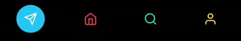
export default BottomNavigationTapPressFinally as you can see, our selectedContainer is now properly centered aligned and animate to selected-tab. But our icons are getting overlapped by selectedContainer and the user can't see the icons.
Solution for hidden tabs
The solution is actually quite simple and straight. We are going to replicate our bottomNavigationBar just beneath it, but it will be out of the screen and the user will never see it.
I know you might be thinking but why do we need to replicate our bottomNavigationBar? The answer is simple whenever our selectedContainer overlaps our iconContainer, we are going to translate the icon from our duplicate bottomNavigationBar to original bottomNavigationBar. This way we will place the icons on top of our selectedContainer.
import React from "react"
import { View, Pressable } from "react-native"
import { Feather } from "@expo/vector-icons"
import styles from "./style"
import Animated, {
useAnimatedStyle,
useSharedValue,
withSpring,
withTiming,
Easing,
} from "react-native-reanimated"
import {
tabBlock,
iconContainer,
activeIndex,
icons,
bottomBarHeight,
} from "./constant.js"
const BottomNavigationTapPress = props => {
const selectedIndex = useSharedValue(activeIndex)
const config = {
damping: 10,
mass: 1,
stiffness: 100,
velocity: 2,
}
const animateSelectedContainer = useAnimatedStyle(() => {
return {
backgroundColor: icons[selectedIndex.value].color,
transform: [
{
translateX: withSpring(
selectedIndex.value * tabBlock + tabBlock / 2 - iconContainer / 2,
{
config,
}
),
},
],
}
})
const animateIconContainer = ({ index }) => {
return useAnimatedStyle(() => {
let offSet = index === selectedIndex.value ? -bottomBarHeight : 0
return {
transform: [
{
translateY: withSpring(offSet, config),
},
],
}
})
}
return (
<>
<Animated.View
style={[styles.bottomTabContainer, { position: "absolute", bottom: 0 }]}
>
{icons.map((item, index) => {
return (
<Pressable
key={item.name}
onPress={() => {
selectedIndex.value = index
}}
>
<View style={[styles.tabContainer, { overflow: "hidden" }]}>
<Animated.View
style={[
styles.iconContainer,
animateIconContainer({ index }),
]}
>
<Feather name={item.name} size={24} color={item.color} />
</Animated.View>
</View>
</Pressable>
)
})}
<Animated.View
style={[styles.selectedContainer, animateSelectedContainer]}
></Animated.View>
</Animated.View>
<Animated.View
style={[
styles.bottomTabContainer,
{ position: "absolute", bottom: -bottomBarHeight },
]}
>
{icons.map((item, index) => {
return (
<View
style={styles.tabContainer}
key={`${item.name} unique unique unique `}
>
<Animated.View
style={[styles.iconContainer, animateIconContainer({ index })]}
>
<Feather name={item.name} size={24} color="white" />
</Animated.View>
</View>
)
})}
</Animated.View>
</>
)
}
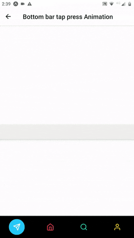
export default BottomNavigationTapPressWe finally did it, our animation is finally ready, and it looks damn beautiful.
Decouple behind the scene magic.
As you can see our duplicate bottomNavigationBar is placed beneath our original. Icons from both bottomNavigationBar are getting animated and translating one position above with bottomBarHeight. This is exactly what we are doing with the animateIconContainer style.
Thanks to overflow: "hidden" we don't see the original translated icons on our screen.
Bonus: Handling keyboard popups.
We got our beautiful bottomNavigationBar with us, but we also need to handle the special textInput case. To understand better let's have a look at how our bottomNavigationBar behaves with textInput now.
As you can see, our bottomNavigationBar is getting stuck with the keyboard and it looks weird. In the ideal case, the bottomNavigationBar should animate and hide.
Understanding the needs
- We need a listener to know when whether the keyboard is visible or not.
- When any textInput is touched and the keyboard is visible, we need to animate our bottomNavigationBar out of the screen.
- When textInput focus is gone and the keyboard is closed, we need to animate back our bottomNavigationBar to the screen.
Adding animation to handle keyboard popups
First let's write one custom hook, which will return whether keyboard is visible or not.
import React, { useState, useEffect } from "react"
import { Platform, Keyboard } from "react-native"
const IsKeyBoardShown = () => {
  const [keyboardVisible, setKeyboardVisible] = useState(false)
  const handleKeyboardShow = () => {
    setKeyboardVisible(true)
  }
  const handleKeyboardHide = () => {
    setKeyboardVisible(false)
  }
  useEffect(() => {
    if (Platform.OS === "ios") {
      Keyboard.addListener("keyboardWillShow", handleKeyboardShow)
      Keyboard.addListener("keyboardWillHide", handleKeyboardHide)
    } else {
      Keyboard.addListener("keyboardDidShow", handleKeyboardShow)
      Keyboard.addListener("keyboardDidHide", handleKeyboardHide)
    }

    return () => {
      if (Platform.OS === "ios") {
        Keyboard.removeListener("keyboardWillShow", handleKeyboardShow)
        Keyboard.removeListener("keyboardWillHide", handleKeyboardHide)
      } else {
        Keyboard.removeListener("keyboardDidShow", handleKeyboardShow)
        Keyboard.removeListener("keyboardDidHide", handleKeyboardHide)
      }
    }
  }, [handleKeyboardHide, handleKeyboardShow])
  return { keyboardVisible: keyboardVisible }
}

export default IsKeyBoardShown
This hook is pretty simple, it just adds listeners to keyboard events and returns whether it's visible or not.
Now let's add the required animations in our main file.
import React from "react"
import { View, Pressable } from "react-native"
import { Feather } from "@expo/vector-icons"
import styles from "./style"
import Animated, {
  useAnimatedStyle,
  useSharedValue,
  withSpring,
  withTiming,
  Easing,
} from "react-native-reanimated"
import {
  tabBlock,
  iconContainer,
  activeIndex,
  icons,
  bottomBarHeight,
} from "./constant.js"
import IsKeyBoardShown from "./isKeyBoardShownHook"

const BottomNavigationTapPress = props => {
  const { keyboardVisible } = IsKeyBoardShown()
  const selectedIndex = useSharedValue(activeIndex)
  const config = {
    damping: 10,
    mass: 1,
    stiffness: 100,
    velocity: 2,
  }
  const animateSelectedContainer = useAnimatedStyle(() => {
    return {
      backgroundColor: icons[selectedIndex.value].color,
      transform: [
        {
          translateX: withSpring(
            selectedIndex.value * tabBlock + tabBlock / 2 - iconContainer / 2,
            {
              config,
            }
          ),
        },
      ],
    }
  })

  const animateIconContainer = ({ index }) => {
    return useAnimatedStyle(() => {
      let offSet = index === selectedIndex.value ? -bottomBarHeight : 0
      return {
        transform: [
          {
            translateY: withSpring(offSet, config),
          },
        ],
      }
    })
  }
  const handleKeyboardAnimation = ({ forActiveBar }) => {
    return useAnimatedStyle(() => {
      let offSet = forActiveBar ? bottomBarHeight * 2 : bottomBarHeight
      return {
        transform: [
          {
            translateY: withTiming(keyboardVisible ? offSet : 0, {
              duration: 500,
              easing: Easing.linear,
            }),
          },
        ],
      }
    })
  }
  return (
    <>
      <Animated.View
        style={[
          styles.bottomTabContainer,
          { position: "absolute", bottom: 0 },
          handleKeyboardAnimation({ forActiveBar: true }),
        ]}
      >
        {icons.map((item, index) => {
          return (
            <Pressable
              key={item.name}
              onPress={() => {
                selectedIndex.value = index
              }}
            >
              <View style={[styles.tabContainer, { overflow: "hidden" }]}>
                <Animated.View
                  style={[
                    styles.iconContainer,
                    animateIconContainer({ index }),
                  ]}
                >
                  <Feather name={item.name} size={24} color={item.color} />
                </Animated.View>
              </View>
            </Pressable>
          )
        })}

        <Animated.View
          style={[styles.selectedContainer, animateSelectedContainer]}
        ></Animated.View>
      </Animated.View>

      <Animated.View
        style={[
          styles.bottomTabContainer,
          { position: "absolute", bottom: -bottomBarHeight },
          handleKeyboardAnimation({ forActiveBar: false }),
        ]}
      >
        {icons.map((item, index) => {
          return (
            <View
              style={styles.tabContainer}
              key={`${item.name} unique unique unique `}
            >
              <Animated.View
                style={[styles.iconContainer, animateIconContainer({ index })]}
              >
                <Feather name={item.name} size={24} color="white" />
              </Animated.View>
            </View>
          )
        })}
      </Animated.View>
    </>
  )
}

export default BottomNavigationTapPress
Now handleKeyboardAnimation does a very simple thing, whenever the keyboard is visible it will animate our bottomNavigationBar out of the screen and when keyboard is not visible it animates back to the screen. With forActiveBar we decide the offset to translate for bottomNavigationBar, because we need to make sure our original and duplicate bottomNavigationBar doesn't overlap each other. So we need to animate our duplicate bottomNavigationBar one position below.
We are finally done!!
As you can see our animation looks neat and our Bottom-Navigation-Bar is complete.
Github repo for the code.
Celebration