Updated July 20, 2022
Animated Progress Bar with Reanimated 2
Animations can add a lot of polish to your app but can be challenging to accomplish in a performant way. Reanimated v2 makes that much easier to do.
This article serves as an introduction to the Reanimated v2 API. We'll be building an animated progress bar, as seen in the following GIF.
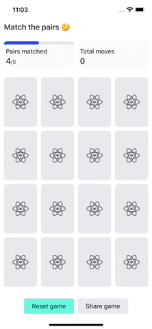
We'll be building the StatsCard component, which will have the progress bar inside of it (that's the part with the "Pairs matched" and "Total moves" at the top of in the above GIF). Whenever the numerator or denominator changes the progress bar width changes.
// screens/MatchThePairs.tsx

<StatsCard
  title="Pairs matched"
  numerator={matchCount}
  denominator={totalPairs}
/>
Starting Code
Let's take a look at our starting point. It has a progress bar that will adjust its width based on the percentage complete but when the width changes there is no animation, it simply jumps to the next width, as seen in the following GIF.
Take note that we're getting the width of the card via the onLayout prop on the View component. That way, regardles of the screen size and card width we're getting an accurate width to do our calculations off of.
// components/cards/Stats.tsx

import React from "react"
import { View, StyleSheet, Text, ViewStyle } from "react-native"

import { Colors, Spacing, Theme } from "src/constants"

type StatsCardProps = {
  title: string
  numerator: number
  denominator?: number
}

export const StatsCard = (props: StatsCardProps) => {
  const { numerator, denominator } = props
  const showProgressBar = denominator !== undefined

  const [cardWidth, setCardWidth] = React.useState(0)

  const progressBarContainerStyles: ViewStyle[] = [styles.progressBarContainer]
  const progressBarStyles: ViewStyle[] = [styles.progressBar]

  if (showProgressBar) {
    progressBarContainerStyles.push({ backgroundColor: Colors.greyMedium })
    progressBarStyles.push({ width: (numerator / denominator) * cardWidth })
  }

  if (numerator === denominator) {
    progressBarStyles.push({ borderBottomRightRadius: 0 })
  }

  return (
    <View
      style={styles.container}
      onLayout={e => setCardWidth(e.nativeEvent.layout.width)}
    >
      <View style={progressBarContainerStyles}>
        <View style={progressBarStyles} />
      </View>
      <View style={styles.content}>
        <Text style={styles.title}>{props.title}</Text>
        <Text style={styles.numerator}>
          {numerator}
          {denominator && (
            <Text style={styles.denominator}>{`/${denominator}`}</Text>
          )}
        </Text>
      </View>
    </View>
  )
}

const borderRadius = Theme.radius
const styles = StyleSheet.create({
  container: {
    flex: 1,
    backgroundColor: Colors.greyLight,
    margin: Spacing.sm,
    borderRadius,
  },
  content: {
    padding: Spacing.sm,
  },
  title: {
    fontWeight: "500",
    fontSize: 16,
    color: Colors.greyDarkest,
    marginBottom: Spacing.xs,
  },
  numerator: {
    color: Colors.greyDarkest,
    fontSize: 20,
    fontWeight: "600",
  },
  denominator: {
    color: Colors.greyDark,
    fontSize: 14,
    fontWeight: "500",
  },
  progressBarContainer: {
    backgroundColor: "transparent",
    height: 8,
    borderTopLeftRadius: borderRadius,
    borderTopRightRadius: borderRadius,
    marginBottom: Spacing.xs,
  },
  progressBar: {
    height: 8,
    width: 0,
    backgroundColor: Colors.blueMedium,
    borderTopLeftRadius: borderRadius,
    borderTopRightRadius: borderRadius,
    borderBottomRightRadius: borderRadius,
  },
})
Migrate to Reanimated 2
If you don't already have Reanimated 2 installed you'll want to do so by following the official docs.
In order to use the animations Reanimated 2 enables we need to use components that understand the animated values that Reanimated provides. Most/all components you would animate are provided under the default export from the library. That means we have Animated.Text, Animated.View, etc.
In the code below we'll want to import Animated from "react-native-reanimated" as well as switch
<View style={progressBarStyles} />to
<Animated.View style={progressBarStyles} />resulting in
// components/cards/Stats.tsx

import React from "react"
import { View, StyleSheet, Text, ViewStyle } from "react-native"
import Animated, { useAnimatedStyle, withSpring } from "react-native-reanimated"

import { Colors, Spacing, Theme } from "src/constants"

type StatsCardProps = {
  /* ... */
}

export const StatsCard = (props: StatsCardProps) => {
  const { numerator, denominator } = props
  const showProgressBar = denominator !== undefined

  const [cardWidth, setCardWidth] = React.useState(0)

  const progressBarContainerStyles: ViewStyle[] = [styles.progressBarContainer]
  const progressBarStyles: ViewStyle[] = [styles.progressBar]

  if (showProgressBar) {
    progressBarContainerStyles.push({ backgroundColor: Colors.greyMedium })
    progressBarStyles.push({ width: (numerator / denominator) * cardWidth })
  }

  if (numerator === denominator) {
    progressBarStyles.push({ borderBottomRightRadius: 0 })
  }

  return (
    <View
      style={styles.container}
      onLayout={e => setCardWidth(e.nativeEvent.layout.width)}
    >
      <View style={progressBarContainerStyles}>
        <Animated.View style={progressBarStyles} />
      </View>
      <View style={styles.content}>
        <Text style={styles.title}>{props.title}</Text>
        <Text style={styles.numerator}>
          {numerator}
          {denominator && (
            <Text style={styles.denominator}>{`/${denominator}`}</Text>
          )}
        </Text>
      </View>
    </View>
  )
}

const borderRadius = Theme.radius
const styles = StyleSheet.create({
  /* ... */
})
The result of this change looks and works exactly the same as before.
Creating Animated Styles
Next we need to set up our animated styles. An Animated.View supports the same style properties as a normal View component (as seen above) in addition to the animated styles unique to Reanimated.
To accomplish this we'll need to import useAnimatedStyle from react-native-reanimated. This hook is one of the main elements in Reanimated v2's API.
From the useAnimatedStyle hook we want to return a style object with the properties that should be animated. In our case it's the width of the progress bar.
Also take note that useAnimatedStyle takes a second argument that serves as an array of depedencies (much like useEffect). Since the width of the bar changes when the numerator, denominator, or cardWidth change we'll add them all as dependencies.
The width is calculated exactly the same as before. The only difference is that we'll add our check of showProgressBar inside the hook.
const progressBarWidthAnimated = useAnimatedStyle(() => {
  if (!showProgressBar) {
    return {
      width: 0,
    }
  }

  return { width: (numerator / denominator) * cardWidth }
}, [numerator, denominator, cardWidth])
That hook in the context of the component:
// components/cards/Stats.tsx

import React from "react"
import { View, StyleSheet, Text, ViewStyle } from "react-native"
import Animated, { useAnimatedStyle, withSpring } from "react-native-reanimated"

import { Colors, Spacing, Theme } from "src/constants"

type StatsCardProps = {
  /* ... */
}

export const StatsCard = (props: StatsCardProps) => {
  const { numerator, denominator } = props
  const showProgressBar = denominator !== undefined

  const [cardWidth, setCardWidth] = React.useState(0)

  const progressBarContainerStyles: ViewStyle[] = [styles.progressBarContainer]

  if (showProgressBar) {
    progressBarContainerStyles.push({ backgroundColor: Colors.greyMedium })
  }

  const progressBarWidthAnimated = useAnimatedStyle(() => {
    if (!showProgressBar) {
      return {
        width: 0,
      }
    }

    return { width: (numerator / denominator) * cardWidth }
  }, [numerator, denominator, cardWidth])

  const progressBarStyles: ViewStyle[] = [
    styles.progressBar,
    progressBarWidthAnimated,
  ]

  if (numerator === denominator) {
    progressBarStyles.push({ borderBottomRightRadius: 0 })
  }

  return (
    <View
      style={styles.container}
      onLayout={e => setCardWidth(e.nativeEvent.layout.width)}
    >
      <View style={progressBarContainerStyles}>
        <Animated.View style={progressBarStyles} />
      </View>
      <View style={styles.content}>
        <Text style={styles.title}>{props.title}</Text>
        <Text style={styles.numerator}>
          {numerator}
          {denominator && (
            <Text style={styles.denominator}>{`/${denominator}`}</Text>
          )}
        </Text>
      </View>
    </View>
  )
}

const borderRadius = Theme.radius
const styles = StyleSheet.create({
  /* ... */
})
By looking at the following GIF you'll see that, once again, the result is exactly the same as what we've had this whole time.
Driving the Animation
Finally we can actually make the animation happen! This happens via withSpring from Reanimated (there are a variety of other animation drivers available as well). This one will allow us to have a spring like animation where it "bounces" over/under the target value.
All we'll do is pass the target value as an argument to withSpring and return that as the width.
return {
  width: withSpring((numerator / denominator) * cardWidth),
}
// components/cards/Stats.tsx
import React from "react"
import { View, StyleSheet, Text, ViewStyle } from "react-native"
import Animated, { useAnimatedStyle, withSpring } from "react-native-reanimated"
import { Colors, Spacing, Theme } from "src/constants"
type StatsCardProps = {
/* ... */
}
export const StatsCard = (props: StatsCardProps) => {
const { numerator, denominator } = props
const showProgressBar = denominator !== undefined
const [cardWidth, setCardWidth] = React.useState(0)
const progressBarContainerStyles: ViewStyle[] = [styles.progressBarContainer]
if (showProgressBar) {
progressBarContainerStyles.push({ backgroundColor: Colors.greyMedium })
}
const progressBarWidthAnimated = useAnimatedStyle(() => {
if (!showProgressBar) {
return {
width: 0,
}
}
return {
width: withSpring((numerator / denominator) * cardWidth),
}
}, [numerator, denominator, cardWidth])
const progressBarStyles: ViewStyle[] = [
styles.progressBar,
progressBarWidthAnimated,
]
if (numerator === denominator) {
progressBarStyles.push({ borderBottomRightRadius: 0 })
}
return (
<View
style={styles.container}
onLayout={e => setCardWidth(e.nativeEvent.layout.width)}
>
<View style={progressBarContainerStyles}>
<Animated.View style={progressBarStyles} />
</View>
<View style={styles.content}>
<Text style={styles.title}>{props.title}</Text>
<Text style={styles.numerator}>
{numerator}
{denominator && (
<Text style={styles.denominator}>{`/${denominator}`}</Text>
)}
</Text>
</View>
</View>
)
}
const borderRadius = Theme.radius
const styles = StyleSheet.create({
/* ... */
})
Now we see some animations! But there are few issues:
- If the bar is 100% full, due to the spring animation, it can overflow beyond the bounds of the card.
- If the value is set to 0 after being at 8 (when you reset the game for example) it glitches by filling/unfilling the bar multiple times
- If the bar is close to full (7/8 for example) it can still overflow beyond the card
Fixing Overflow Issues
The problems we're seeing are a result of using spring animations, but we can fix those with a few arguments to withSpring.
To fix overshoot issue we can "clamp" the animation to not extend past the target value with overshootClamping. This takes some of the fun away from the spring animation though so we'll only do this if the bar is 0% or 100% full.
To fix the third point of a 90% full bar overflowing the card we can reduce how "bouncy" the spring is by adjusting the stiffness option.
// components/cards/Stats.tsx

import React from "react"
import { View, StyleSheet, Text, ViewStyle } from "react-native"
import Animated, { useAnimatedStyle, withSpring } from "react-native-reanimated"

import { Colors, Spacing, Theme } from "src/constants"

type StatsCardProps = {
  /* ... */
}

export const StatsCard = (props: StatsCardProps) => {
  const { numerator, denominator } = props
  const showProgressBar = denominator !== undefined

  const [cardWidth, setCardWidth] = React.useState(0)

  const progressBarContainerStyles: ViewStyle[] = [styles.progressBarContainer]

  if (showProgressBar) {
    progressBarContainerStyles.push({ backgroundColor: Colors.greyMedium })
  }

  const progressBarWidthAnimated = useAnimatedStyle(() => {
    if (!showProgressBar) {
      return {
        width: 0,
      }
    }

    // We clamp at 0 and the last number so that the bar doesn't extend outside of
    // the card. If we jump from 8 to 0 (reseting a game) the bar glitches and
    // empties, refills, and empties again. Clamping fixes that.
    const useClamping = numerator === 0 || numerator >= denominator
    return {
      width: withSpring((numerator / denominator) * cardWidth, {
        overshootClamping: useClamping,
        stiffness: 75,
      }),
    }
  }, [numerator, denominator, cardWidth])

  const progressBarStyles: ViewStyle[] = [
    styles.progressBar,
    progressBarWidthAnimated,
  ]

  if (numerator === denominator) {
    progressBarStyles.push({ borderBottomRightRadius: 0 })
  }

  return (
    <View
      style={styles.container}
      onLayout={e => setCardWidth(e.nativeEvent.layout.width)}
    >
      <View style={progressBarContainerStyles}>
        <Animated.View style={progressBarStyles} />
      </View>
      <View style={styles.content}>
        <Text style={styles.title}>{props.title}</Text>
        <Text style={styles.numerator}>
          {numerator}
          {denominator && (
            <Text style={styles.denominator}>{`/${denominator}`}</Text>
          )}
        </Text>
      </View>
    </View>
  )
}

const borderRadius = Theme.radius
const styles = StyleSheet.create({
  /* ... */
})
Much better! Now we have a fun and glitch-free animation for the progress bar thanks to Reanimated 2.
You can find the final code on Github.
Further Learning
Reanimated 2 is incredibly powerful. Friend of React Native School, Aditya Pahilwani, wrote a fantastic article on using Reanimated 2 to build an animated tab bar.
What's an area in your app where you could benefit from some subtle animations? Let us know on Twitter.
